DOM Renewable Energy
Client
DOM Renewable Energy
Scope
Logo and visual identity design, presentation design, infographic design
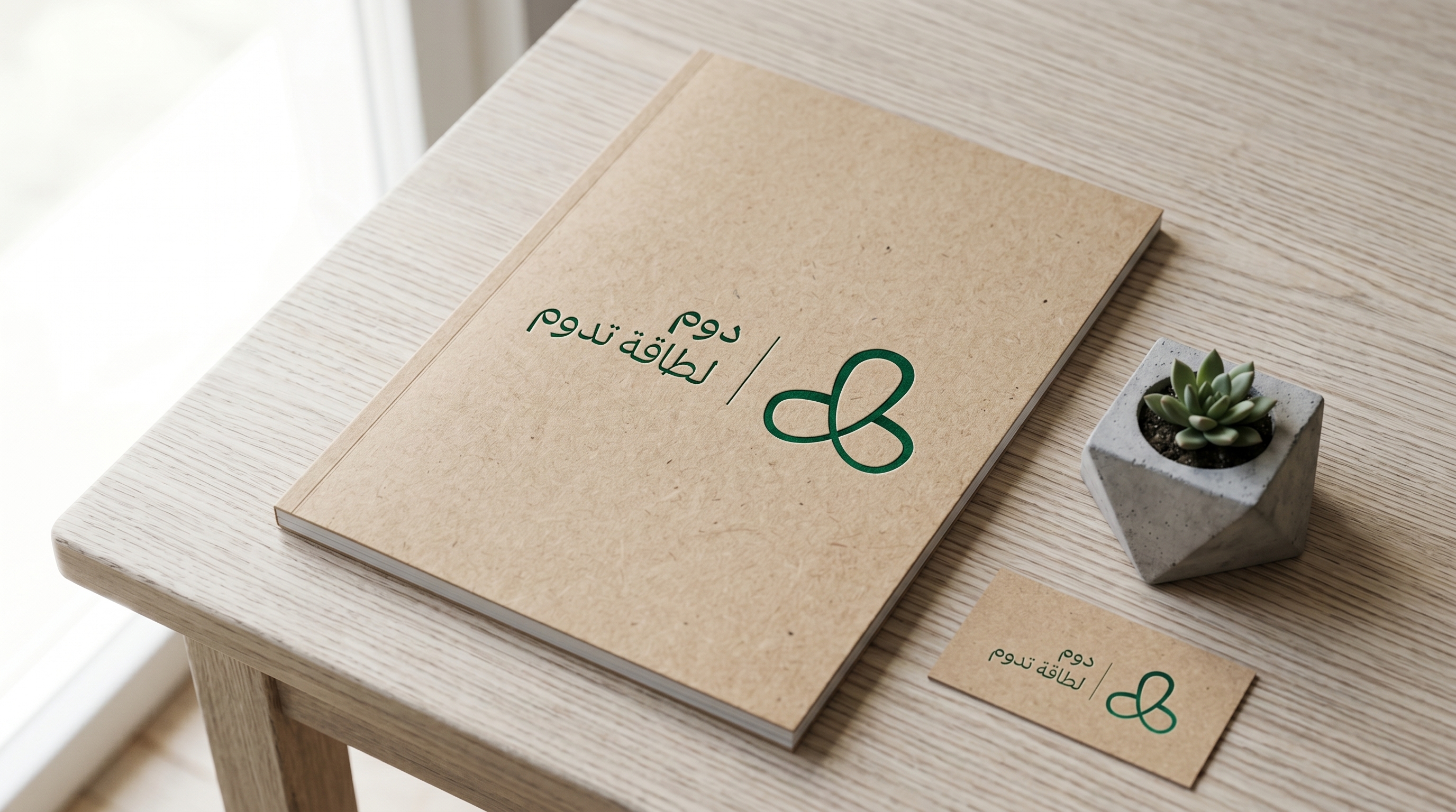
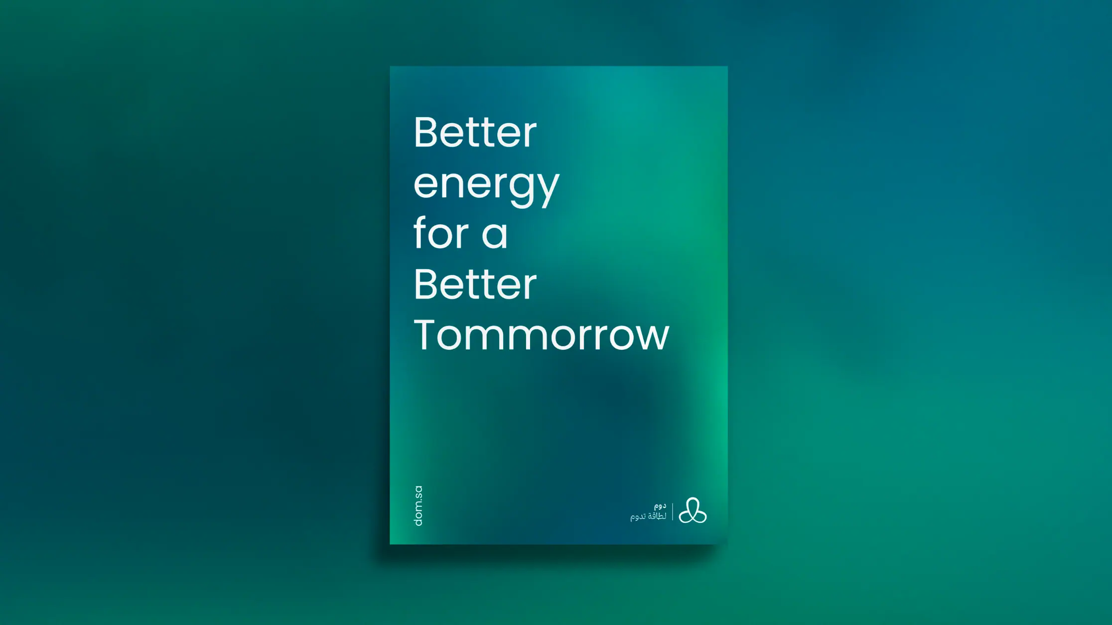
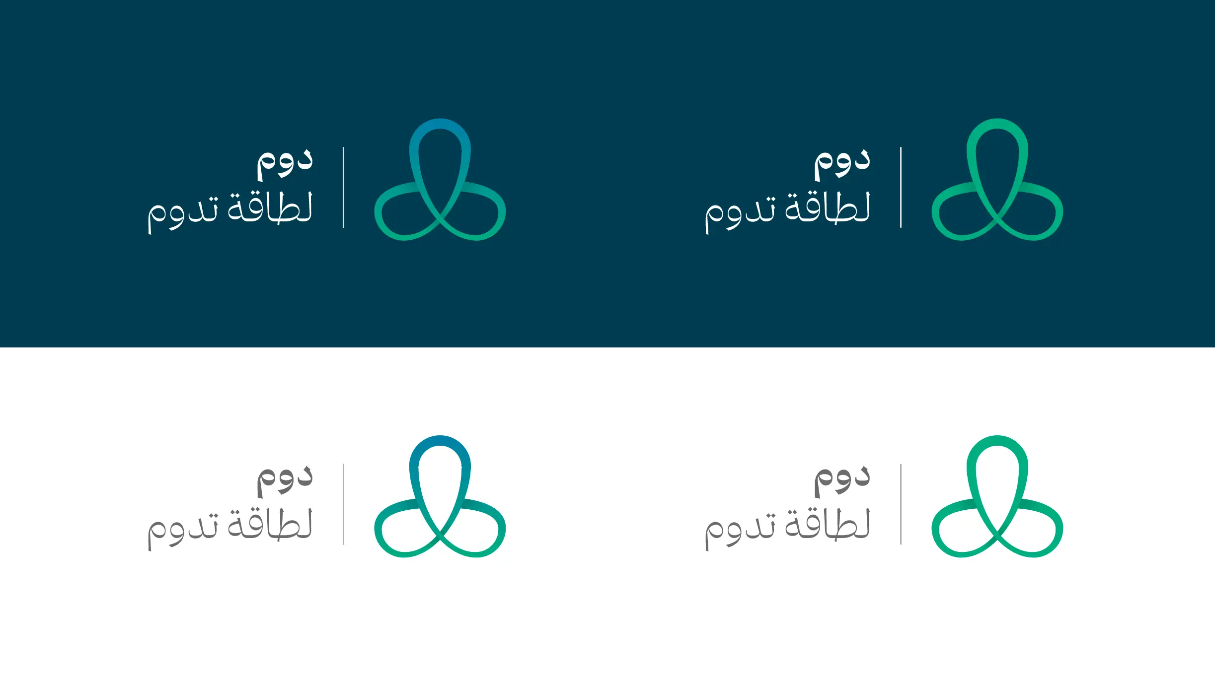
Built to Last, Like the Name
Three letters. Three pieces. Three meanings - woven into a mark that is flexible, renewable, and enduring. Just like DOM itself.
The Design Logic
We started with the name itself: DOM. Three Arabic letters became three graphic pieces. The first piece - vertical, shaped like a location pin - declares DOM as the destination for renewable energy solutions. The two horizontal pieces come together to form the infinity symbol (∞) - expressing continuity, sustainability, and renewal. The three pieces unite into a logo that is flexible, timeless, and unmistakably DOM.
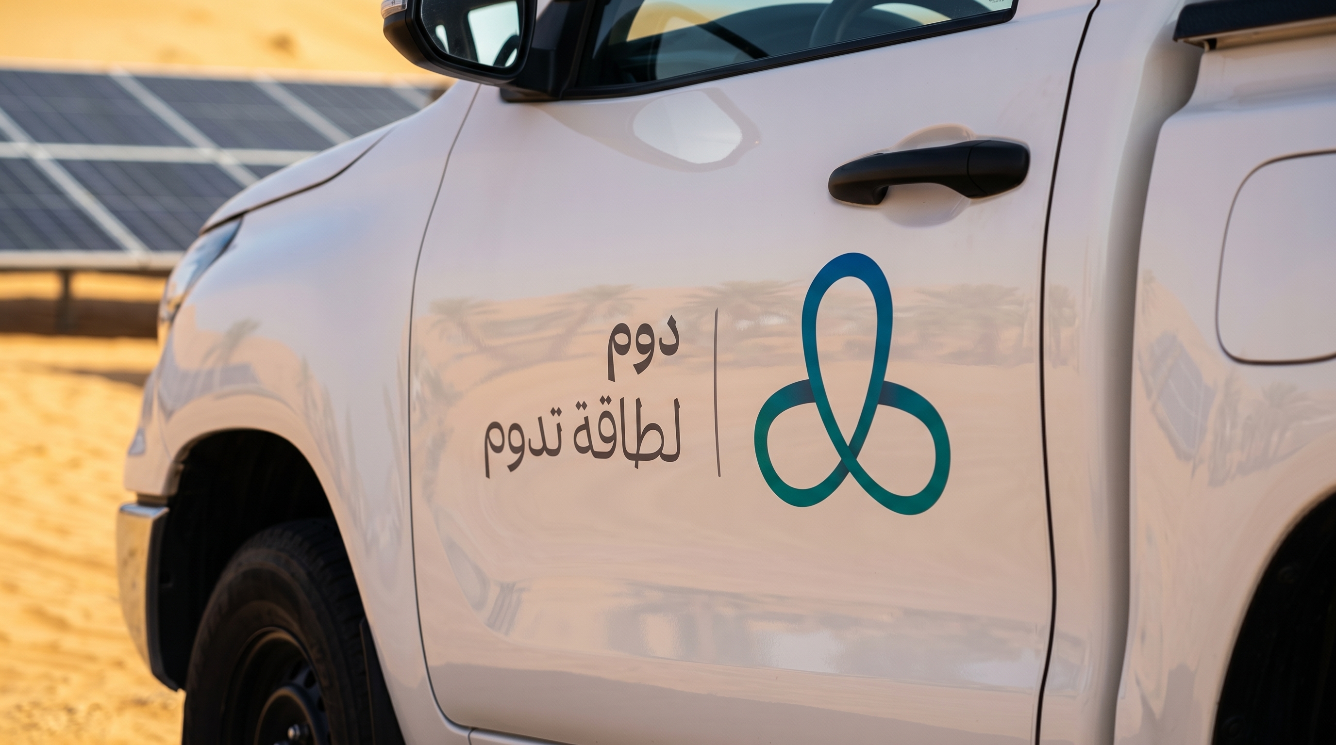
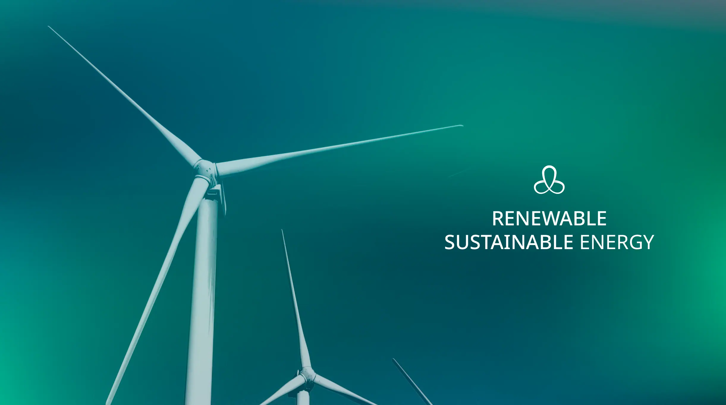
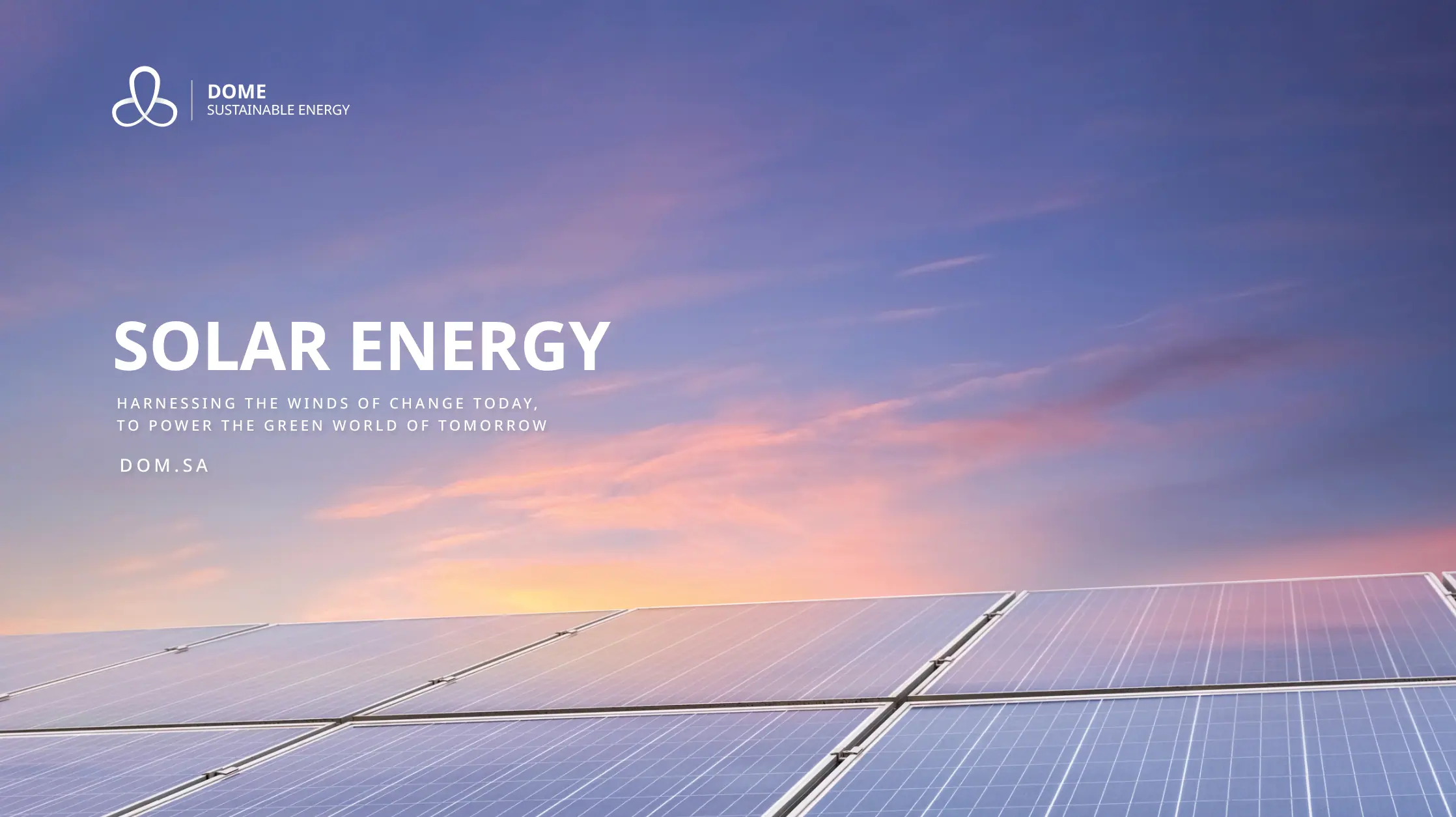
The Color Language
Emerald green is the color of clean energy and sustainability. We chose it to be DOM's voice across every visual touchpoint - alive, trustworthy, and far from ordinary.

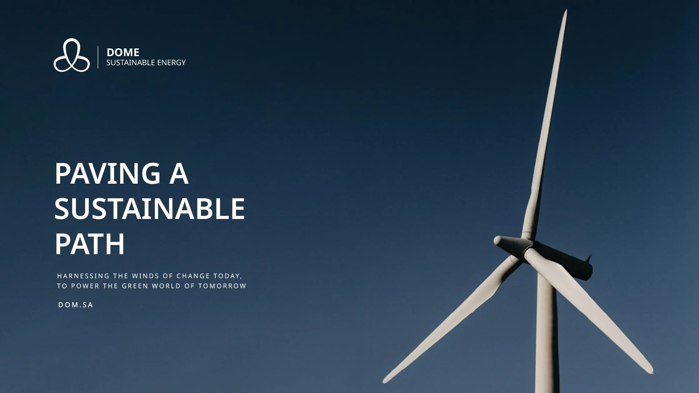
Identity in the Real World
A strong logo isn't just what looks good on screen - it's what holds up on every surface. We extended the identity across a complete suite of brand materials: from business cards to official documents, from stamps to covers - every detail treated with the same precision as the original mark.